
Understanding the Web


WebSciX 2025
Satellite Event of ACM WebSci Conference of WSTNet
Advancing the interdisciplinary study of the Internet, World Wide Web (WWW) and Artificial Intelligence (AI), and their impact on human lives.
- Date: October 14-15, 2025
- Venue: J N Tata Auditorium, IISc Bangalore
WebSciX 2025 is co-located with the Symposium on Data for Public Good with a common registration portal. Registration for WebSciX enables registrants to also participate in the other tracks of the Symposium.
Registration link: https://dataforpublicgood.org.in/symposium-2025/symposium-2025-register/
EXCLUSIVE OFFER for IIITB Students
- Be among the FIRST 50 IIITB students to register and get your Symposium Pass absolutely FREE!
- Spots are limited — grab yours before they’re gone!
- Register now using: IIITB Student Registration.
- Please bring your IIITB student ID card while attending the Symposium.
About the conference
WebSciX India is a proposed satellite event of the ACM Web Science Conference, dedicated to advancing the interdisciplinary study of the Internet, World Wide Web (WWW), and Artificial Intelligence (AI) and their impact on human lives in India and surrounding regions. WebSciX builds upon the Web Science for Development (WS4D) series of events conducted in India since 2019.
WebSciX 2025 is a community-building workshop intended to build a strong core technical committee that can organize the annual WebSciX conferences. WebSciX 2025 is hosted as a co-located track at the Symposium on Data for Public Good, organized at IISc Bangalore, between October 14-15 2025.
Schedule for Day 1 : October 14, 2025
Plenary session of WebSciX on October 14th is part of a series of plenary sessions scheduled as part of the Symposium on Data for Public Good. Refer to the link for details of other sessions.
Plenary session: Panel Discussion on Preserving Indian Knowledge Systems in the Age of AI.
Timings – 17:00 to 18:00
Schedule for Day 2 : October 15, 2025
| WebSciX Agenda | ||
| 10:15 | 10:30 | Welcome Address |
| 10:30 | 11:10 | “How The Post Internet World Order has changed International Relations” by Ambassador S. Swaminathan |
| 11:10 | 11:50 | Prof. Shalini Urs |
| 11:50 | 12:30 | “Data Exchange: the third leg of the DPI (Digital Public Infrastructure) stool” by Prof. Inder Gopal |
| 12:30 | 14:00 | LUNCH |
| 14:00 | 14:40 | “From Knowledge Bases to Narrative Spaces” by Prof. Srinath Srinivasa |
| 14:40 | 15:20 | “Modelling the Sources, Interventions, and Coordination in the Dynamics of Spread” by Prof. Sakthi Balan |
| 15:20 | 16:00 | Prof. PK |
| 16:00 | 16:30 | TEA |
| 16:30 | 17:10 | Ms. Srijoni |
| 17:10 | 17:45 | Poster Session and Closed door meeting |
Panelists Details
G. Srinivasaraghavan, holds a PhD in Computer Science from the Indian Institute of Technology Kanpur. Dr.Raghavan has over 18 years of industry experience spanning TISL, Infosys Technologies and Aztecsoft Ltd. He has been with IIITB as a Professor since 2012 researching and teaching on a range of areas including algorithms, optimization and machine learning.
Prathosh received his Ph.D from the Indian Institute of Science (IISc), Bangalore in 2015, in the area of temporal data analysis. He submitted his Ph. D thesis three years after his B.Tech in 2011. Subsequently, he worked in corporate research labs including Xerox Research India, Philips research, and a start-up in CA, USA. His work in the industry, focussing on healthcare analytics, led to the generation of several IP, comprising 15 (US) patents of which 10 are granted and 6 are commercialized. He joined IIT Delhi in 2017 as an Assistant Professor in the computer technology group of Electrical Engineering where he served for four years. His current research includes guided deep-representational learning, cross-domain generalization, machine learning for scarce data, signal processing, and their applications in healthcare. He has co-founded a start-up Cogniable.Tech which builds learning algorithms for behavioural healthcare (first-place winner of the recent AI start-up challenge by Govt. of India) and also actively engaged with several corporate industries, start-ups, and medical centres (E.g., AIIMS) in solving interesting technical problems.
Abhishek Upperwal is the Founder of Soket AI, a research-driven AI lab focused on ethical Artificial General Intelligence. He holds a Master’s in Computational Data Science from IISc Bangalore, specializing in High-Performance Computing, Distributed Systems, and Large-Scale Model Training. His expertise spans CUDA optimizations, MPI, and graph algorithms, with a strong foundation in scaling AI models efficiently.
At Soket AI, Abhishek led the development of Pragna-1B, a 1.25 billion parameter foundation model built from scratch for Hindi, English, Gujarati, and Bengali, featuring one of the most efficient Indic tokenizers. He also created the Bhasha Dataset Corpus, a high-quality, open-source dataset for Indian languages.
Abhishek is also the Principal Investigator of Project EKA supported by the IndiaAI Mission, an initiative to build state-of-the-art AI models that prioritize Indian languages while aiming to surpass global benchmarks. EKA is designed to strengthen India’s AI sovereignty, ensuring the country not only preserves its linguistic diversity in AI but also leads in cutting-edge model development and AI research.
Sanket Patil is a data science leader with significant experience in Indic Natural Language Processing. Early in his industry career at Reverie Language Technologies, he played a key role in developing the company’s NLP stack. There, he led a team creating solutions for complex challenges in transliteration, multilingual search, machine translation, and named entity recognition for various Indian languages. Today, as the Chief Data Strategy Officer at DataWeave, Sanket uses this hands-on experience to guide the company’s AI strategy and the development of intelligent data products. With over a decade of post-PhD experience and a doctorate in Distributed Systems from IIIT Bangalore, he brings a first-principles approach to his work in solving complex data challenges.
Speaker Details
Ambassador S. Swaminathan is a senior member of the Indian Foreign Service with over three decades of experience, having served in eight countries including Sri Lanka, Belgium, Pakistan, Malaysia, Vietnam, Germany, Brazil, and Iceland. His postings have included roles as Counsellor, Deputy Head of Mission, Minister, Consul General, and Ambassador of India, including India’s first resident Ambassador to Iceland and a tenure as Ambassador to Mongolia. His career has concentrated primarily on relations with India’s neighbours and economic diplomacy. In addition, he has had varied experiences in other areas including political, cultural, press and media relations, education, science and technology, renewable energy, defence, development assistance, HR etc.
Ambassador Swaminathan has worked extensively on bilateral relations with Sri Lanka, Pakistan, Bangladesh, Maldives, Afghanistan, and Iran, and has significant experience in the EU, EEA, and ASEAN regions. In Brazil, he served as Deputy Head of Mission in Brasilia and Consul General in Sao Paulo, contributing to the formation of IBSA and facilitating the India-Mercosur Framework Agreement. He has engaged with Heads of State, Cabinet Ministers, business leaders, and academicians, negotiating treaties, agreements, and investment deals, and promoting trade and technology transfers. His strengths include trade policy, investment promotion, technology transfer, renewable energy projects, and project implementation. He has also served as a UN Election Observer in South Africa (1994), participated in G-20 and IBSA ministerial meetings, led humanitarian missions, and overseen embassy and residence construction projects in Berlin, Kuala Lumpur, and Brasilia.
How the Post-Internet World Order has Changed International Relations
In today’s Internet-driven world, diplomats continue to perform their core functions, but the methods have fundamentally changed. Instant communication via email and the growing reliance on web-based platforms have transformed the management of diplomatic work.
This talk will explore the following areas:
Prof. Inder Gopal is the CEO of the IUDX Program and an Industry Professor at the Indian Institute of Science (IISc). He previously served as Vice President of Software at Ericsson, where he led the launch of their edge computing initiatives. Before that, he was Vice President of Networking at IBM, where he had responsibility for all of IBM’s hardware and software networking products. He has also held senior leadership roles as Chief Architect at AT&T and Chief Technology Officer at Prodigy. An entrepreneur as well, he founded and successfully exited two venture-funded start-ups—ReefEdge and Iptivia—and continues to serve as an investor and board member in several companies.
Prof. Gopal was the Founding Chairman of OpenDaylight, a leading open-source networking software group that brought together dozens of top-tier companies. He has a distinguished research record with 20 patents and over 70 publications, along with two IBM Outstanding Innovation Awards earned during his time at the IBM T.J. Watson Research Centre. He has served as editor for several technical journals, was elected a Fellow of the IEEE, and holds a Ph.D. from Columbia University, New York, and a B.A. from Oxford University, England.
Data Exchange: the third leg of the DPI (Digital Public Infrastructure) stool
India’s Digital Public Infrastructure (DPI) has seen Aadhaar and UPI emerge as strong pillars, but the third leg – data exchange – remains underdeveloped despite being crucial to unlock DPI’s full potential. This talk will explore why data exchange must be treated as core public infrastructure, the capabilities it requires—such as discoverability, interoperability, consent-based sharing, and privacy safeguards—and lessons from initiatives like the India Urban Data Exchange (IUDX) and Agricultural Data Exchange (ADeX). It will also examine challenges of regulation, governance, and adoption, while presenting a roadmap for scaling open, federated, domain-specific data exchanges to drive innovation and public good.
Dr. Shalini R. Urs is an internationally recognized academic leader and institution builder with over four decades of experience in higher education. She began her career at the University of Mysore in 1976 and retired in 2016, during which time she founded two pioneering academic institutions — the International School of Information Management (ISiM) at the University of Mysore and the MYRA School of Business in Mysuru.
Her expertise encompasses digital scholarship, digital libraries, ontology development, social network analysis, and the development of digital public infrastructures to advance open science. A pioneer of digital initiatives in India, Dr. Urs spearheaded the Electronic Theses and Dissertations (ETD) movement and established the Vidyanidhi Digital Library and eScholarship Portal, among other landmark projects.
She is a sought-after speaker on topics including digital scholarship, e-Science, open science, and social network analysis, and serves as a consultant to a variety of academic and research initiatives.
Dr. Urs has received numerous honors, including:
Currently, she hosts InfoFire, a podcast series presented by Information Matters and ASIS&T. This pioneering hybrid format blends biography and scholarship, illuminating the personal, intellectual, and societal forces that shape the evolving information landscape. To date, she has published 27 episodes of the series.
Open Data, Open Science: Building a Global Public Good
In this presentation, I examine the transformative potential of open data and open science to advance societal well-being through transparency, collaboration, and accessibility.
As non-excludable and non-rivalrous public goods, open data and open science foster innovation, address global challenges, and promote equitable knowledge access. Guided by the FAIR principles (Findable, Accessible, Interoperable, Reusable) and UNESCO’s 2021 Open Science Recommendation, they enable society to harness knowledge more effectively. Yet challenges such as data privacy, intellectual property, and sustainable funding demand ethical, inclusive policies to maintain public trust.
Central to this vision are robust knowledge infrastructures, conceived as shared resources that underpin open science. These infrastructures embody Merton’s CUDOS principles (Communalism, Universalism, Disinterestedness, Organized Skepticism) and are essential for ensuring transparency, reliability, and collaboration. By strengthening such infrastructures, society can more effectively respond to pandemics, climate change, and inequality, building a resilient, collaborative “Republic of Science.”
Sakthi Balan is a Professor in the Department of Computer Science and Engineering, Shiv Nadar University Chennai, Kalavakkam – 603 100. He also serves as an external consultant to the Wadhwani School of AI, IIT Madras. Presently he is doing a collaborative funded project on Domain-Specific LLM with Prof. Ravindran Balaraman (IIT Madras) and his team. He has 7 years of corporate experience prior to his academic career. Sakthi Balan’s research interests lies in the broad areas of Web Science and Data Analytics. In specific, his interests include Social Network Analysis, Bias & Privacy in the Web, LLM and Action Recognition in Sports Videos. Previously, he has worked extensively in the field of Theoretical Computer Science. He has many publications in various International Journals, Conferences and peer-reviewed invited volumes. He has had many academic visits such as: (1) UWO, Canada (2002 and 2004 to 2008) (2) USF, Tampa, USA (2001) (3) EPFL, Lausanne, Switzerland (2003), (4) Hungarian Academy of Science, Budapest (2007), (5) RPI, Troy, USA (2017), (6) NUS & NTU Singapore (2023) and so on. He has guided 2 PhD students, 8 MTech students and 70+ BTech students. He has served as TPC member for COLING 2025, ASONAM 2024, ADCOM 2024, ACM WebSci 2024, and WI-IAT 2024. He has served as TPC member in ACM WebSci for the past three years. He has reviewed papers for Conferences such as AAAI ICWSM for the past four years and for LREC-COLING 2024, KDD 2021. Two of his works on Tracking in Indian News Websites presented and published in AAAI ICWSM 2021 and ACM WebSci 2021 has got featured in Open Magazine. More information can be found in https://sakthibalan.in. He can be contacted at [email protected].
Modelling the Sources, Interventions, and Coordination in the Dynamics of Spread
Spread of infection and information is a well-studied area. There are several models investigated in the literature. This talk will be presenting models of the spread on three factors – source of the spread, interventions and the coordination in the spread. We investigate the usage of a mass-action model, network-based model and social network concepts for the same.
Prof. Srinivasa heads the Web Science Lab and serves as Dean (R&D) at the International Institute of Information Technology – Bangalore (IIITB), India. He holds a Ph.D. (magna cum laude) from the Berlin Brandenburg Graduate School for Distributed Information Systems (GkVI), Germany, an M.S. (by Research) from the Indian Institute of Technology – Madras (IITM), and a B.E. in Computer Science and Engineering from The National Institute of Engineering (NIE), Mysore, India. His research focuses on Web Science, exploring how the World Wide Web affects humanity and how it can enable social empowerment and capability building.
Prof. Srinivasa has contributed to several initiatives in technology-enhanced education, including the Edusat program by Vishveshwaraiah Technological University, NPTEL, the Switzerland-based online MBA program Educatis, and IIITB’s educational outreach with UpGrad. He has served on technical and organizational committees for international conferences such as ICWSM, ACM Hypertext, COMAD/CoDS, ODBASE, BDA, and ACM Web Science. He has also served on Boards of Studies at Goa University and Christ University, as a member of the Academic Council at NIE Mysore, and as a technical reviewer and associate editor for journals including VLDB Journal, ACM Computing Surveys, Springer AI Ethics, IEEE TKDE, IEEE TCC, and Sadhana. He is the recipient of numerous national and international grants and awards from organizations such as EU Horizon 2020, UK Royal Academy of Engineering, Research Councils UK, MeitY, DST, Siemens, Intel, Mphasis, EMC, and Gooru. He has also led the AI initiative for the “Karnataka Data Lake” project by the Planning Department of the Government of Karnataka, promoting data- and evidence-based planning and decision-making.
From Knowledge Bases to Narrative Spaces: Repurposing AI for Inclusive Knowledge Management
Traditional knowledge bases, centered on curating and linking discrete facts, often embed structural biases that favor dominant perspectives, limiting diverse interpretations. Historically, storytelling was the cornerstone of knowledge management, weaving facts into rich, contextual narratives that embraced pluralistic worldviews. This talk proposes a paradigm shift toward narrative spaces, leveraging AI to transform knowledge management. By repurposing AI to prioritize storytelling over rigid fact-based systems, narrative spaces enable dynamic, inclusive frameworks that integrate diverse perspectives and cultural contexts. We explore how AI can be designed to facilitate pluralistic interpretations, fostering equitable knowledge ecosystems that reflect the complexity of human experience and move beyond the limitations of conventional knowledge bases.
Prof. Ponnurangam Kumaraguru (“PK”) is a Professor of Computer Science at IIIT-Hyderabad. He is an Associate Researcher at Robert Bosch Centre for Data Science & AI – IIT Madras, Visiting Faculty at IIT Kanpur and an Adjunct faculty at IIIT Delhi. PK was inducted an ACM Distinguished Member in 2021. PK is an ACM India Council Member, and Chair of the Publicity & Membership Committee of ACM India. PK is a TEDx and an ACM Distinguished & ACM India Eminent Speaker. PK received his Ph.D. from the School of Computer Science at Carnegie Mellon University (CMU). His Ph.D. thesis work on anti-phishing research at CMU contributed in creating an award-winning startup – Wombat Security Technologies, wombatsecurity.com. Wombat was acquired in March 2018 for USD 225 Million. PK was listed in the World’s 2% Scientists by Stanford University in Nov 2020. He is a senate member of IIIT Una, LNMIIT and is on various Board of Studies / Academic Council of different institutes across the country. He has co-authored research papers in the field of Computational Social Science, Privacy and Security in Online Social Media, Cyber Security, Social Computing, Data Science for Social Good, amongst others. In addition to his contributions to academia, PK is in an advisory role on various government organizations, government committees, including a 8 member committee on Non-Personal Data by Government of India, chaired by Mr. Kris Gopalakrishnan. PK and his students have played an integral role in developing a technology used by many State and Central Government agencies in India. PK’s research work regularly gets featured on news media, including print, online, and TV within India and across the world; to list a few, BBC, CBC, CBS, CNN, Doordarshan, Economic Times, Indian Express, NBC, New Scientist, NewYorker, Reuters, Times of India, USA Today (on 1st Feb 2021), Washington Post, and many more. PK Spear heads ACM India’s programs on improving the quality of PhD students in Computing in India — PhDClinic & Anveshan Setu Fellowship. In his Dean’s role, he managed a team of 15 faculty members and 10+ admin staff, including Associate Dean of Student Affairs, overseeing hostel, sports centre, health centre, student {well-being, clubs, mentorship program}, technical & cultural fests. He was the Founding Head of Cybersecurity Education and Research Centre (CERC) at IIIT-Delhi. PK started and successfully manages PreCog (precog.iiit.ac.in), a research group at IIIT-Hyderabad.
Web Science Research @ Precog
This talk will present some of the research we have done at Precog https://precog.iiit.ac.in/ in the broader area of Web Science. I will discuss projects that leverage publicly available data to study privacy, elections, misinformation and fake content, Reddit communities, and browser extensions. The talk will also reflect on insights and challenges from our work at the intersection of technology, society, and the web.
Srijoni Sen is a lawyer advising Digital Public Infrastructure projects at the International Institution of Information Technology, Bangalore. Previously, she has been a faculty member at National Law School Bangalore and led the Public Law team at the Vidhi Centre for Legal Policy. Srijoni’s interests lie at the intersection of law, technology and governance.
AI for Digital Public Infrastructure: Legal Issues in Responsible AI adoption
Governments and private actors around the world are exploring whether the integration of AI capabilities into Digital Public Infrastructure has the potential to amplify these benefits while creating new opportunities for innovation in governance and public service delivery. This rapid expansion of AI tools in government, including decision making and agenting applications, raises important questions about the use and impact of these technologies. This talk examines the current state of play in AI regulation and its implications on DPI efforts. Specifically, it will explore the various applications algorithmic systems have in government, and the constitutional and policy questions it has already begun to raise around the world.
Venue
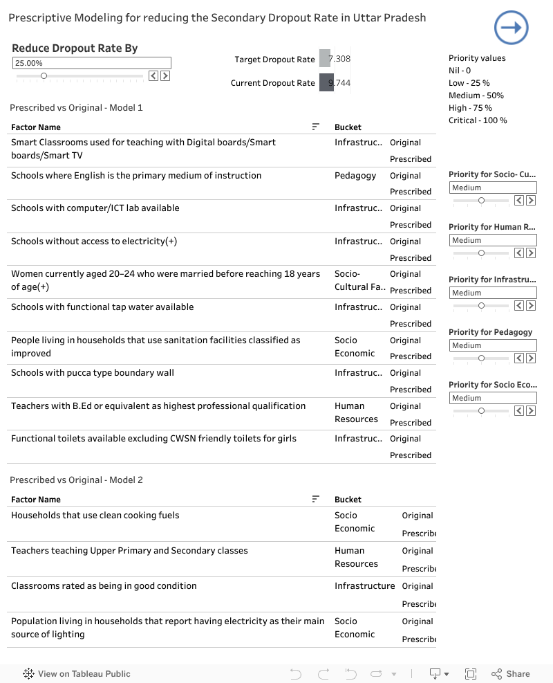
Schools which teach class 6 – 8 in Urban Uttar Pradesh were considered
Based on the analysis, the following are deduced:
| Lower Dropouts | Higher Dropouts |
| Higher percentage of Private Schools | Higher percentage of Minority Schools |
| Hindi as medium of instruction | Urdu as medium on instruction |
| Good Classrooms | Teachers who are not graduates |
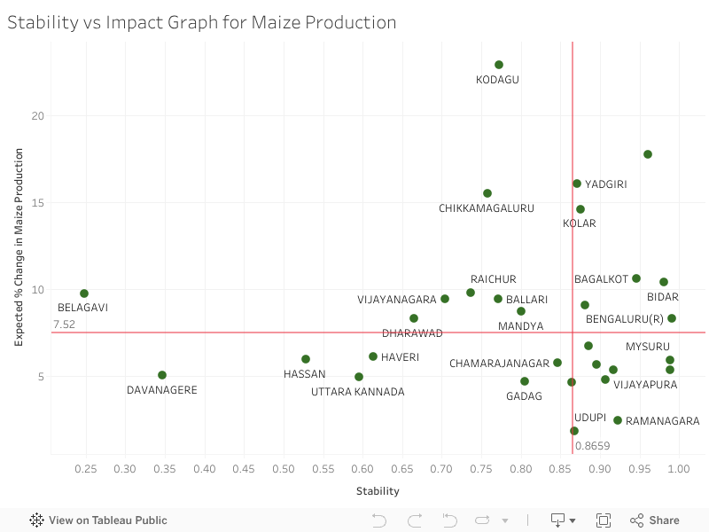
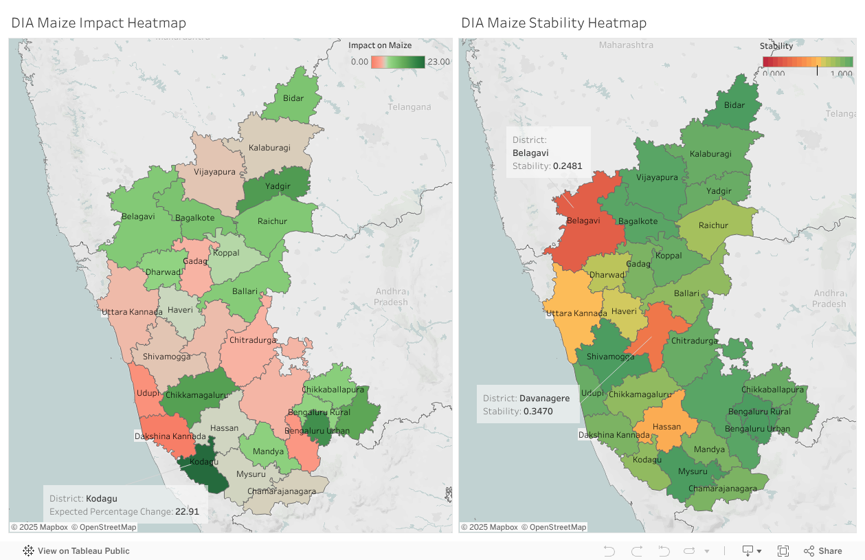
In some of these factors, the heatmaps of dropout and factors are very similar, in some the visual difference in not striking, hence we have also included a scatter plot which displays the effects of the factor

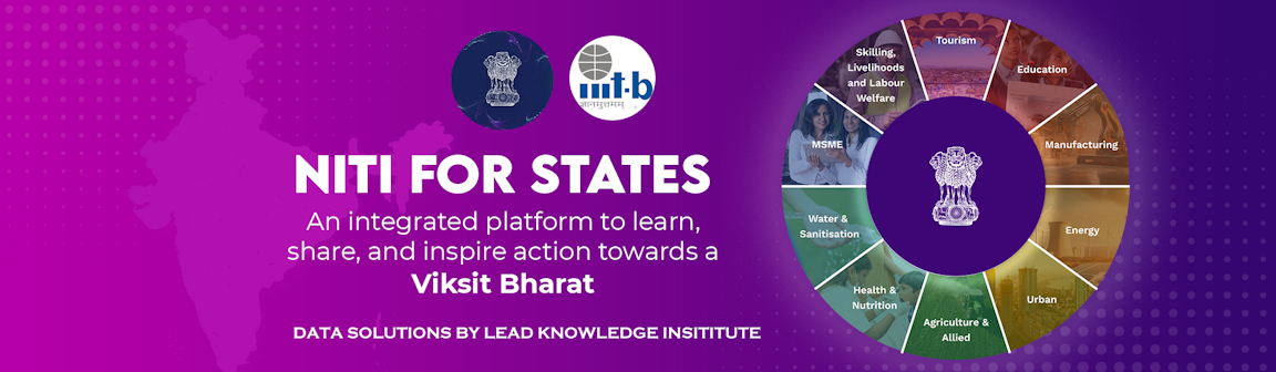
Schools which teach class 6 – 8 in Rural Uttar Pradesh were considered
Based on the analysis, the following are deduced:
| Better Learning Outcomes | Lower Learning Outcomes |
| Good Classrooms | Hindi medium |
| Schools with Electricity | Schools with lower internet connectivity |
| Any female above yrs of age having attended school | More Government Schools |
In some of these factors, the heatmaps of dropout and factors are very similar, in some the visual difference in not striking, hence we have also included a scatter plot which displays the effects of the factor

Schools which teach class 6 – 8 in Rural Uttar Pradesh were considered
Based on the analysis, the following are deduced:
| Lower Dropout | Higher Dropout |
| Classrooms in Good condition | From districts with lower GDDP/ GSDP |
| Higher percentage of Female teachers | Teachers Qualification Below Graduate |
| English medium as first language | Hindi medium as First Language |
In some of these factors, the heatmaps of dropout and factors are very similar, in some the visual difference in not striking, hence we have also included a scatter plot which displays the effects of the factor
We also have a district wise sensitivity – so as to enable bird’s eye view of the major contributing factors in each district

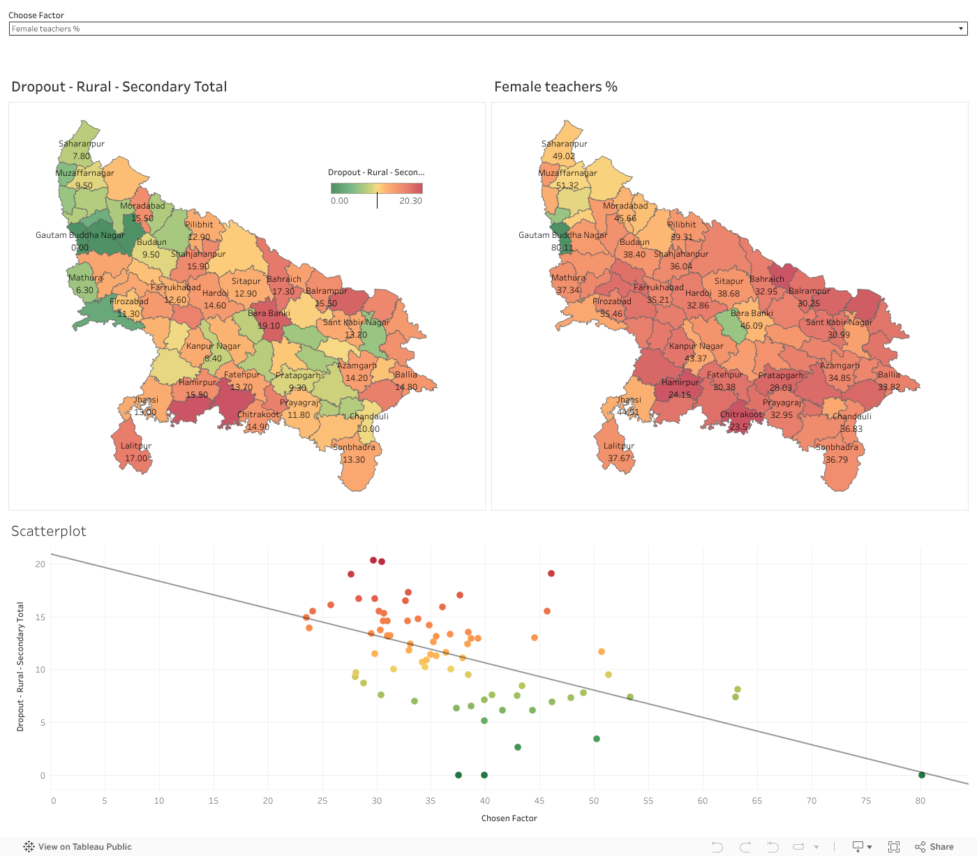
Schools which teach class 3 – 5 in Rural Uttar Pradesh were considered
Based on the analysis, the following are deduced:
| Better Learning Outcome | Lower Learning Outcome |
| Regular Government Teachers | Children who are under weight |
| Any Female above 6 years ever attended schools | Children who are stunted |
| Classrooms in good condition | More enrollment in Government Schools |
In some of these factors, the heatmaps of dropout and factors are very similar, in some the visual difference in not striking, hence we have also included a scatter plot which displays the effects of the factor
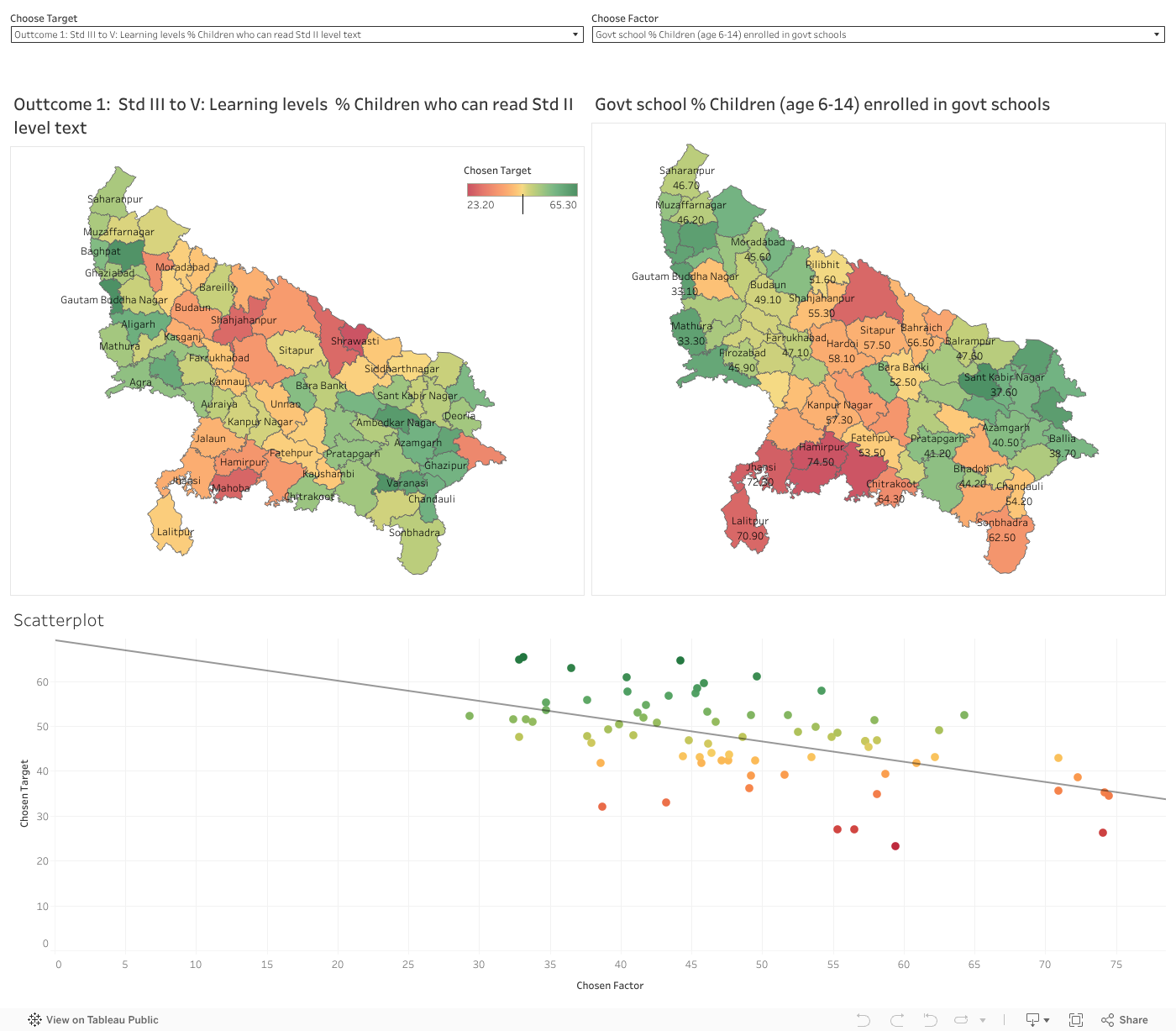
शिक्षण की गुणवत्ता और ड्रॉपआउट दोनों को संबोधित करके शैक्षिक परिणामों का रूपांतरण
डेटा विश्लेषण का दायरा
2 मिलियन से अधिक डेटा पॉइंट्स का विश्लेषण, जिनमें शामिल:
• 75 ज़िले
• 2.55 लाख विद्यालय
• 5.76 करोड़ छात्र
• अनेक डेटा सेट, जैसे UDISE, NFHS, SECC, ASER, यूपी सांख्यिकी
भाषाई परिदृश्य
उत्तर प्रदेश की प्रमुख बोलियाँ हैं — अवधी, बघेली, भोजपुरी, ब्रज भाषा, बुंदेली, खड़ी बोली, और कन्नौजी।
जनसांख्यिकीय और आर्थिक मुख्य बिंदु
माध्यमिक शिक्षा में कम ड्रॉपआउट दर के शीर्ष 3 कारण
ग्रामीण क्षेत्र:
शहरी क्षेत्र:
माध्यमिक शिक्षा में अधिक ड्रॉपआउट दर के शीर्ष 3 कारण
ग्रामीण क्षेत्र:
शहरी क्षेत्र:
बोली के अनुसार ग्रामीण प्रगति के पैटर्न
खड़ी बोली–भाषी ज़िले (पश्चिमी यूपी): ग्रामीण क्षेत्रों में मजबूत सीखने के परिणाम लेकिन शहरी क्षेत्रों में ड्रॉपआउट का अधिक जोखिम, संभवतः औद्योगिकीकरण और नौकरी पलायन के कारण।
भोजपुरी–भाषी ज़िले (पूर्वी यूपी): ग्रामीण क्षेत्रों में मजबूत सीखने के परिणाम लेकिन शहरी क्षेत्रों में ड्रॉपआउट अधिक, संभवतः शिक्षा या रोजगार के लिए शहरी क्षेत्रों या अन्य राज्यों में पलायन के कारण।
अवधी – भाषी ज़िले : राज्य के लगभग मध्य भाग में स्थित, जिसमें कानपुर, लखनऊ, अयोध्या, प्रयागराज जैसे शहरी मिश्रण वाले क्षेत्र शामिल हैं। ग्रामीण क्षेत्रों में औसत सीखने के परिणाम दिखाई देते हैं, लेकिन शहरी क्षेत्रों में यह प्रवृत्ति काफी सुरक्षात्मक है, जहाँ अनेक निजी शैक्षणिक संस्थान और सरकार द्वारा प्रदत्त मजबूत शैक्षिक अवसंरचना मौजूद है।